You know when you scroll through Instagram or walk past a flyer and something just clicks—you pause, you look, maybe even buy. That instant connection? It’s not magic. It’s the kind of visual impact you can create after taking a simple color theory class tailored for real-world business use.
As a small business owner, you don’t have a second to waste in today’s visual-first world. Customers are making snap judgments based on your logo, packaging, or Instagram feed before they even read your name. If your brand looks off—or worse, forgettable—you lose them.
This is where a basic understanding of color theory can change the game.
You don’t need an art degree. You just need a smart, simplified approach to learning what colors mean, how they work together, and how they influence perception. This article is your friendly, no-fluff color theory class—designed especially for small business owners who want to stand out, build brand trust, and sell more, all by using color intentionally.
Why Color Theory Matters More Than Ever
Color affects how people feel about your brand—before they even interact with it. According to a study by the Institute for Color Research, people make a subconscious judgment about a product within 90 seconds, and up to 90% of that judgment is based on color alone.
This means your color choices are directly tied to how credible, attractive, and memorable your business seems. If you’re using random colors or just picking what you like personally, you’re leaving money (and trust) on the table.
Understanding the Basics of Color Theory
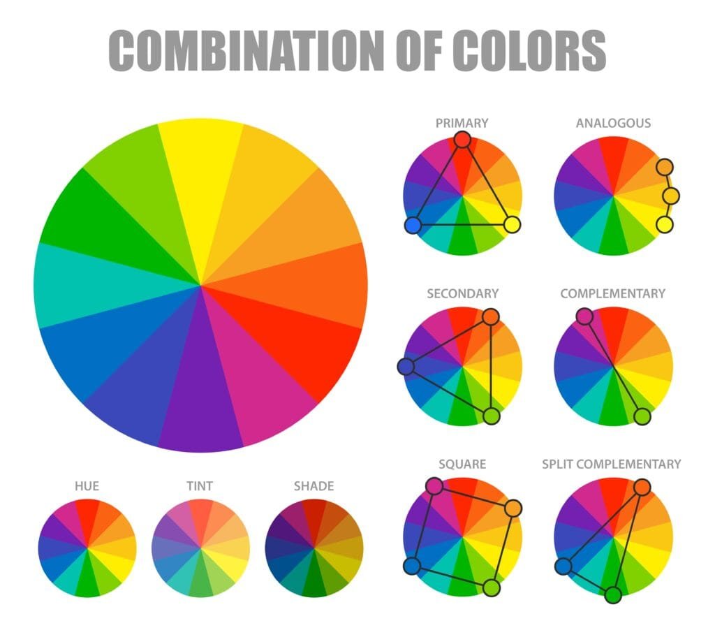
A quick color theory class primer:
- Primary Colors: Red, Blue, Yellow. These can’t be made from other colors.
- Secondary Colors: Orange, Green, Purple. Made by mixing primary colors.
- Tertiary Colors: More nuanced blends like teal or magenta.
- Hue vs. Shade: Hue is the pure color. Shade is the color + black. Tint = color + white.
Knowing this helps you choose colors with intention, not guesswork.
The Psychology of Color: What Colors Actually Say
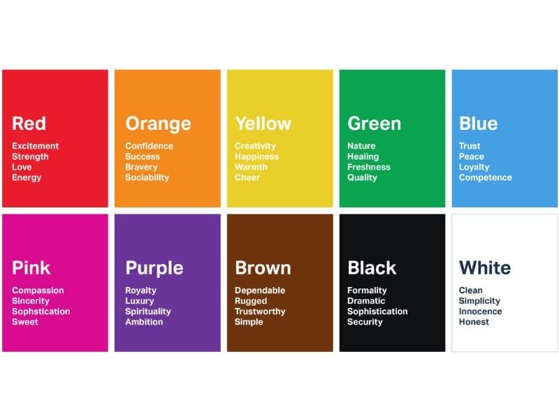
Each color communicates something different:
- Red = Bold, urgency, energy (great for food, sales, action)
- Blue = Trust, calm, professionalism (finance, health, tech)
- Yellow = Optimism, cheer, attention-grabbing (retail, kids, events)
- Green = Nature, growth, freshness (eco, wellness, health)
- Black/Gray = Luxury, elegance, modernity (fashion, design)
Your job? Choose colors that say what you want your brand to say.
How to Build a Brand Color Palette That Works
Think of your brand like a team. Your color palette is the uniform. It needs to:
- Match Your Audience: Who are they? What vibe are they drawn to?
- Reflect Your Values: Are you playful or professional? Minimal or loud?
- Be Flexible: Can it work on packaging, social media, and merch?
Try this simple formula:
- 1 dominant color (brand essence)
- 1 secondary color (supportive)
- 1 neutral (balance)
- 1 accent (to pop!)
Tools like Adobe Color or Coolors can help you test combinations.
Common Color Mistakes Small Businesses Make
- Too many colors: It gets chaotic and confusing.
- Inconsistent use: Using different tones of blue on different platforms weakens trust.
- Ignoring accessibility: Low contrast can make your text unreadable.
- Following trends blindly: Neon green might be hot this year—but will it age well?
Real-Life Example: From Confusing to Cohesive
A local pet grooming shop came to us with bright red, blue, yellow, and green splashed across their flyers. It looked fun—but also hectic.
We narrowed it down to a calm blue and cheerful orange, reflecting their caring but playful service. Within weeks, their bookings increased and customer reviews mentioned how “professional and trustworthy” the brand looked.
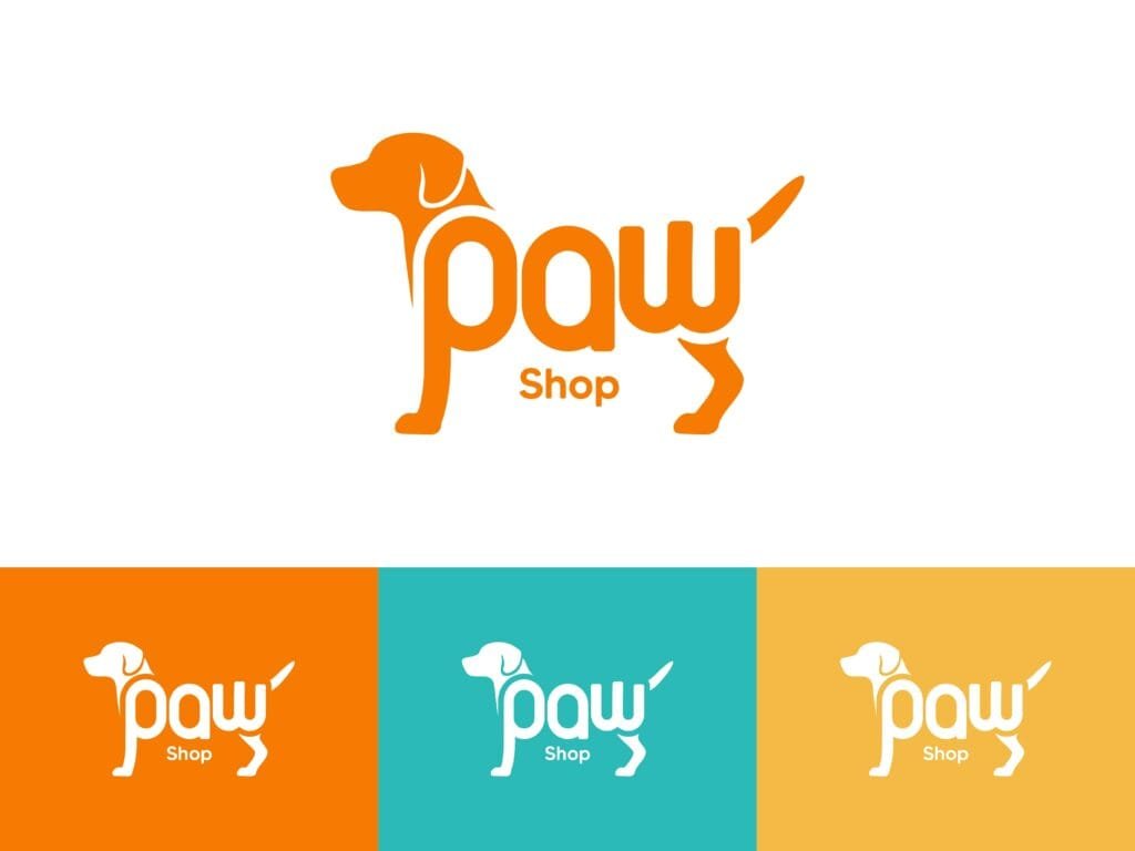
That’s the power of visual cohesion.
Quick Tips to Apply Right Now
- Do a color audit: Are your colors consistent across all platforms?
- Research competitors: What color palettes are common? How can you stand out?
- Ask your audience: What feelings do your current visuals give off?
What a Color Theory Class Can Teach You About Winning Attention
Color isn’t a finishing touch, it’s the foundation. As a small business owner, your brand visuals have to work hard for you, and color is the fastest way to communicate who you are.
Understanding color theory empowers you to make better design choices and create a brand experience that sticks.
Want help building a brand color palette that connects and converts? Explore Koalart Creative’s custom branding services and start transforming your visuals with clarity and confidence.

