How Brand Personality and Visual Identity Shape Business Success
In today’s crowded market, your brand is more than just your name or logo, it’s how people feel when they see or interact with your business. And first impressions happen fast. According to Google Research, users form a judgment about a brand within just 0.05 seconds based on visuals alone. That means your visual identity isn’t just decoration, it’s your frontline for trust and recognition.
Whether you’re a cozy café, a boutique pet shop, or a fast-growing fitness brand, having a well-defined brand personality and visual identity can make all the difference.
Let’s face it: without a distinct look and voice, you risk blending in with competitors. Worse, you could be sending mixed messages that confuse potential customers or make your business seem less trustworthy. The good news? You don’t need a massive budget to build a brand that looks polished and feels personal. You just need to be intentional.
This article breaks down what brand personality and visual identity are, why they matter, and how you can use them to elevate your business—without hiring a giant agency. We’ll also explore the common pitfalls that make even great businesses look forgettable—and show you how to avoid them.
What Is Brand Personality and Why It Matters
Your brand personality is the emotional tone and human traits associated with your business. Think of it like your business’s vibe. It influences everything from the colors you choose to the language you use in your captions.
Ask yourself:
- Are you fun and energetic?
- Sleek and professional?
- Wholesome and approachable?
Once you define your personality, every design decision becomes clearer.
Here are three common brand personalities:

- Playful and Bold
- Bright colors
- Fun illustrations or mascots
- Conversational language
- Luxurious
- Minimalist layouts
- Monochrome palettes with gold or silver accents
- Elegant typography
- Trustworthy and Professional
- Clean, balanced design
- Classic font choices
- Calm, neutral tones
When your brand personality is clear, people know what to expect from you and they remember you for it.
Understanding Visual Identity
Visual identity is the design system that brings your brand personality to life. It includes:
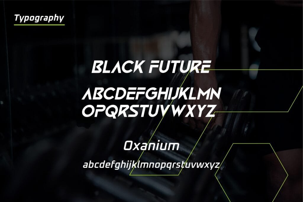
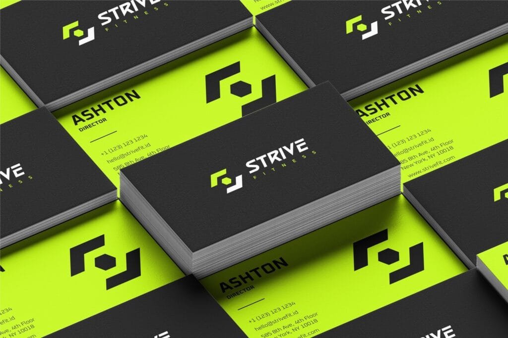

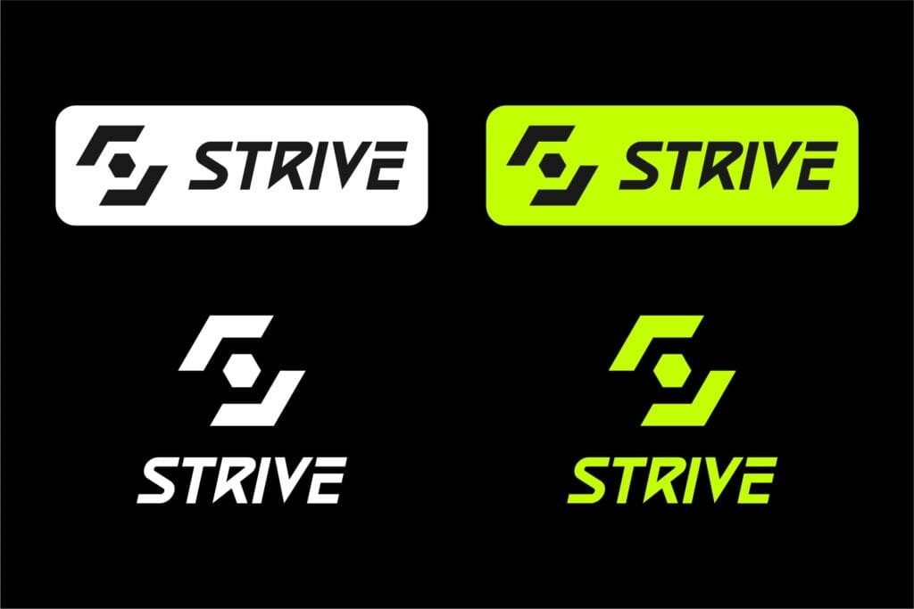
- Logo and logo usage rules
- Brand colors and fonts
- Graphic elements (patterns, textures, icons)
- Photography and illustration style
- Layout rules for digital and print
Why does this matter? Because consistent visual identity helps:
- Build trust and credibility
- Increase brand recognition
- Unify your marketing across platforms
A professional look makes you seem more established—yes, even if you’re just starting out.
Logo Rules You Shouldn’t Ignore
Your logo is one of the most visible parts of your brand. But even the best logo can fall flat if it’s used inconsistently. Here’s a quick cheat sheet:
✅ Do:
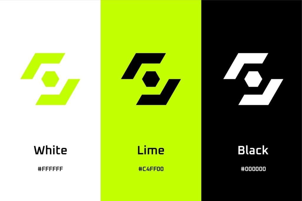
- Use approved versions (color, black, white)
- Keep clear space around your logo
- Scale proportionally
❌ Don’t:
- Change fonts or colors randomly
- Place it on cluttered or similar-color backgrounds
- Stretch, squish, or rotate it
Pro tip: Create a mini style guide even a one-page doc to help keep everything aligned.
Design Principles That Make Your Brand Stand Out
Design isn’t just about making things look pretty, it’s about communicating clearly. Follow these design principles to make your brand visuals more effective:
- Contrast: A striking difference between two or more design elements to create visual interest, emphasize certain features, and guide the audience’s eye to important information.
- Alignment: Keep elements organized (especially in menus, flyers)
- Hierarchy: Hierarchy is the arrangement of design elements based on their level of importance or priority, so that the audience’s eyes know what to look at first, and then what to look at next.
- Movement: Add energy with angles, swooshes, or directional elements
- Repetition: Repetition builds consistency and trust. When your designs feel familiar, your brand becomes more recognizable.
- Proximity: grouping related items together to show connection. It avoids confusion and improves usability.
- White Space: Also called negative space, white space is the empty area between elements. It brings balance and clarity to your design.
- Color Theory: Color isn’t just visual, it’s emotional. The right palette can instantly communicate your brand’s personality.
- Typography: (font choices) plays a big role in how people perceive your brand.
Example: A spa might use soft waves and pastel colors to signal calm, while a punk band might go for bold angles and gritty textures.
Read this: Design Principles Every Small Business Owner Should Know
Consistency Is Everything
Ever seen a brand that looks totally different on Instagram vs. their website vs. their packaging? It’s confusing and it hurts trust.
Consistency across touchpoints:
- Makes your brand easier to recognize
- Reinforces your message
- Looks more professional
This doesn’t mean everything has to be identical. It just needs to feel like it came from the same brand family.
Common Mistakes That Hurt Your Brand
- Random Colors or Fonts
- This dilutes your identity. Stick to your chosen palette and typography.
- Inconsistent Logo Usage
- Avoid resizing, recoloring, or reformatting your logo.
- Overcrowded Layouts
- Give your content breathing room. Clean design = premium feel.
- Ignoring Mobile Design
- Make sure your graphics and layouts work on phones. Most people will see your brand on a small screen first.
Example: Building a Brand Personality & Visual Identity for a Small Coffee Shop
Let’s say you’re the owner of “Sunny Brew Café”, a cozy neighborhood coffee shop that focuses on cheerful vibes, great coffee, and community connection.
Step 1: Define Your Brand Personality
Start by choosing words that describe the personality of your brand:
- Adjectives: Warm, Playful, Welcoming, Cheerful, Trustworthy
- Think about your audience: Young professionals, students, and locals who value comfort, creativity, and good vibes. They connect with light-hearted, friendly, and upbeat energy.
Step 2: Choose Your Visual Elements
Your visual elements should reflect your personality:
- Brand Colors:
- Main: Sunny Yellow (#FFD966), Sky Blue (#8ECDF2)
- Accent: Terracotta Orange (#E07B39)
- Neutral: Soft White and Warm Gray
- Fonts:
- Headings: Poppins Bold (playful and clean)
- Body Text: Lato Regular (modern and easy to read)
- Imagery Style:
- Hand-drawn illustrations of coffee cups, sunrises, and smiling faces
- Bright, candid photos of happy customers and colorful drinks
Also read: Color Theory Class Every Small Business Needs
Step 3: Create Brand Assets
With your identity set, create the following assets:
- Logo: A smiling sun rising from a coffee cup, in both full color and black & white versions
- Business Cards: Bright background with simple contact info, playful icons
- Flyers: Promoting events like “Latte Art Thursdays” or “Live Acoustic Nights”
- Social Media Templates: Ready-made layouts with consistent colors and fonts for daily posts and stories
- Email Signature: Includes logo, contact info, and friendly tagline: “Bringing sunshine to your mornings!”
- Website: A single-page site with menu, location, story, and gallery—all styled consistently
Step 4: Build a Visual Style Guide
Document all the key rules to keep your visuals consistent:


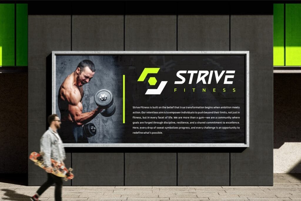
- Logo usage: Clear space rules, acceptable color variations
- Colors: Hex codes for each brand color and guidance on how to combine them
- Fonts: When to use which typeface, font sizes, and line spacing
- Photography: Style, lighting, mood (e.g., always warm and natural light)
- Iconography and illustration: Only hand-drawn, rounded-edge style allowed
Store this guide in a shareable format (PDF or Notion link) and give it to your staff, social media manager, or any designer working with you.
Step 5: Apply Across All Channels
Make sure your visual identity is applied consistently everywhere:
- Social Media: Highlight colors and fonts used in every post and story
- Packaging: Coffee cups, pastry bags, and stickers feature your logo and playful icons
- In-Store Signage: Menu boards match your brand fonts and colors
- Ads & Promotions: Digital and print ads follow your visual style guide
Why Small Businesses Struggle and How to Fix It
Many small businesses skip branding altogether or only think about their logo. But customers are drawn to consistency, personality, and polish.
Without a clear brand identity:
- You blend into the crowd
- You seem less trustworthy
- Your visuals don’t convert
With it:
- You command attention
- You can charge higher prices
- You build customer loyalty
Koalart Creative: Helping Small Brands Look Big
This is where services like Koalart Creative come in. If you’re overwhelmed by DIY design or struggling to keep everything consistent, we’ve got your back.
At Koalart Creative, we specialize in helping small businesses build a brand that feels true to them and looks ready for the big leagues. From logo design to motion graphics, packaging, and even merchandise, we make sure your brand shows up strong wherever it appears.
What makes us different?
- Affordable packages tailored to small business needs
- 24/7 availability for urgent requests
- Free consultations and aftercare support
- Designs built around your brand’s unique personality
Our goal is to make you look polished and professional without blowing your budget.
Key Takeaways
- Brand personality sets the emotional tone of your business
- Visual identity ensures you show up consistently and professionally
- Clear guidelines and thoughtful design build trust and recognition
- You don’t need a massive budget, just the right strategy and support
Read: 10 Proven Marketing Strategies for Restaurants: Ultimate Hacks
A strong brand helps you stand out, earn trust, and grow your business. And if you’re not sure where to start, working with creative pros like Koalart Creative can give you the boost you need.
Need a second opinion on your current branding? Or just want to brainstorm design ideas for your next launch? Reach out anytime—no pressure, just good conversation.


